I have just got a new job which involves creating a new application in WPF. I initially applied for this job, as it represented a challenge, which I quite like. At the interview stage, I was shown an existing WPF application that the existing team had created. There was nothing really that wrong with it, but it somehow just didn’t feel that WPF like.
They had the tools to do a good WPF app, for sure, they are bright people (otherwise I would not have wanted the job), but they were approaching it like a WinForms app, and it just felt, well WinForms like.
Now with all the new WPF arsenal that we have at our disposal, there is really no need that a WPF app needs to look like a WinForms app.
Using things like Animations we can do some really cool things, to set a WPF app apart, but taking a step back, I firmly believe what makes a world of difference is a common set of styled/templated controls. That are used throughout the application.
If you take the time to re-style the existing controls, you can create some quite cool looking controls that still work just the same as the original controls do, but they just look better.
I really think this 1 step, can contribute is such a major way to the way the whole app is perceived, it worth the time you spend customising the controls.
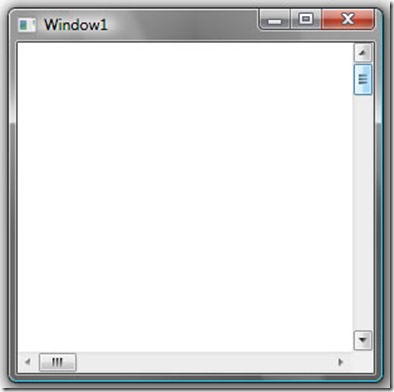
For example let’s consider a ScrollViewer control, whos default appearance looks like this:
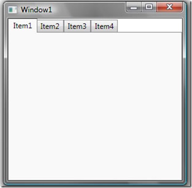
And how about a TabControl, which by default looks like this:
Now I am no expert with Styling/Templating, but in 2 hours last night I was able to come up with some pretty satisfactory Styles/Templates for both of these controls. These new Styles/Templates, aid in branding of the overall app.
For me personally, each of the native control types that I end up using in the new WPF application, I will be attempting to create a new version of it, which sets the app apart, and gives it a touch of difference.
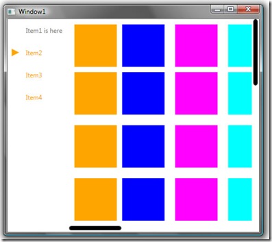
In this figure there is a ScrollViewer contained within a TabItem (Item2). The overall TabControl has been altered to give the appearance you see here.
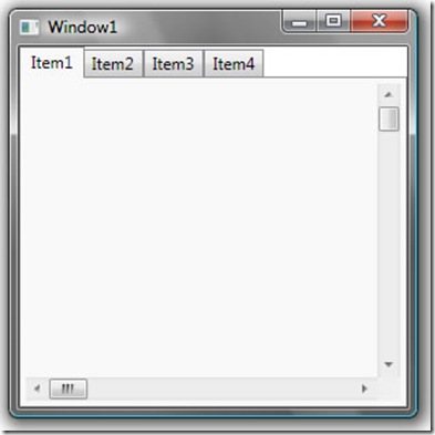
So by just spending a bit of time working with Styles/Templates you are able to create some pretty slick looking stuff. After all this screen shot is just a TabControl and a ScrollViewer, which looks nothing like the default control as shown below.
I’m sure most of you will agree, the benefits from creating your own control styles, will surely help create a brand for your application. So got for it, don’t be shy, give it a try, like I say these 2 styles took me about 2 hours last night.
PS: I am unable to share the code for these 2 control Styles as I will be using them as part of a project. Sorry


What do you say to the people who complain that it doesn’t match the Windows standard guidelines and all that?
I’m on your side on this, but I’m curious about your take on this issue.
Well Max
My actual take on this would be “go swivel, if you want a windows WinForms looking app, dont use WPF, or me for that matter”.
Well you did ask, I think there is ZERO point making a WPF app that emulates the crap winforms look.
Windows applications are shrinking, i disagree with you, learning new windows apps methods are not worth the time. microsoft needs to wake up and smell the online apps defeat.
Windows applications are shrinking, i disagree with you, learning new windows apps methods are not worth the time. microsoft needs to wake up and smell the online apps defeat.
Hi Sacha,
As always, you’re articles are always insightful, and with these articles, you’re helping me make some progress with WPF.
I think you’re highlighted I very organisational trend, that companies have, and tend to stay away from, due to the unknown element (or fear) of designing something that is very futuristic looking.
Are companies ready to have applications built with this type of style? I hope so. But it needs people like yourself to show us, and give that wow factor to what can be achieved using WPF.
I’m very new to WPF, and I’m trying hard to have visual concepts of how to re-design a winform app, which can be very frustrating at times.
Is this a problem for other developers moving from VB6/.NET style apps onto WPF? Examples of WPF applications are starting to appear, which really help. But something is always missing… I wonder if this is a business approach to design?
One day, I’ll have an answer! But, in the mean time, your help and guidance will always be needed.
Many Thanks
I totally agree, though I used to belong to the other camp! The days of standardized user interface LOOKs are behind us. I still think that user interface controls should for the most part WORK (and therefore arguably “feel”) the same (for example, scrollbars should have the same behavior, button clicks should be able to be canceled by dragging the mouse off of them while pressed, etc.). Thankfully WPF is great for this because it allows for restyling without reimplementation–even in extreme cases like your tab example above.
People don’t complain that a web site doesn’t match some standard look and feel, and I really expect the desktop to move in this direction as well, where each application has its own branded look, but with control behaviors that can be assumed by the user. Interface is both an art and a science, and being locked into what Microsoft dictates is not going to progress it in either form. Look how much the web has changed in a decade.
Thanks there, good comments man.